

What Will You Learn?
By the end of this lesson, you will be able to:
- Understand why data visualization matters in AI and data science
- Navigate the Tableau Public interface confidently
- Create different types of charts (bar, line, pie, scatter, maps)
- Build interactive dashboards that tell data stories
- Apply best practices for effective visualization
Imagine you have a spreadsheet with 10,000 rows of data about student performance across India. You could stare at those numbers for hours and still miss important patterns. But what if you could turn those numbers into a colorful map showing which states perform best? Or a chart revealing that scores drop every year in July?
That’s the magic of data visualization. It transforms raw numbers into pictures that our brains can understand instantly.
Here’s the thing: humans are visual creatures. We process images 60,000 times faster than text. A well-designed chart can communicate in seconds what a table of numbers takes minutes to explain.
And Tableau is one of the most powerful tools for creating these visualizations and the best part is that Tableau for Students is completely free.
Why Data Visualization Matters
Data visualization matters because it turns raw data into clear, meaningful visuals that are easier to understand.
You can spot patterns, compare information, and make decisions faster when data is shown through charts and dashboards. It also builds analytical thinking, helping learners explain what the data actually tells us rather than just looking at numbers.
Numbers vs. Visuals: A Quick Comparison
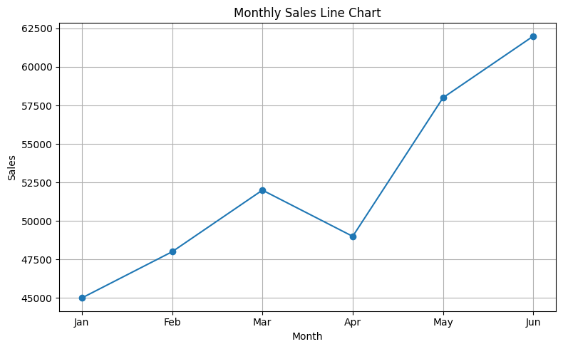
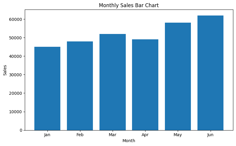
The data:
| Month | Sales |
|---|---|
| Jan | 45000 |
| Feb | 48000 |
| Mar | 52000 |
| Apr | 49000 |
| May | 58000 |
| Jun | 62000 |
What the table shows: Six numbers. Hard to see patterns quickly.
What a line chart shows: Instant understanding — sales are growing with a dip in April!
The same data can tell different stories depending on how you visualize it. So you need to choose the right chart type depending on what you want to unserstand. For example, when the same data is represented as a bar chart, it tells you that the sale in the first four months was almost at the same level.
When to Use Visualization
| Situation | Why Visualization Helps |
|---|---|
| Finding patterns | Trends become visible |
| Comparing values | Differences are obvious |
| Showing proportions | Parts of whole are clear |
| Presenting to others | Easier to understand |
| Exploring data | Discover unexpected insights |
| Making decisions | See evidence clearly |
Introduction to Tableau Public
Tableau Public is a free data visualization tool that lets you create interactive charts and dashboards.
Why Tableau?
| Feature | Benefit |
|---|---|
| Drag-and-drop interface | No coding required |
| Professional quality | Industry-standard visualizations |
| Interactive | Users can explore data |
| Free version available | Tableau Public costs nothing |
| Widely used | Valuable skill for future |
Getting Started
Step 1: Access Tableau Public
- Go to: https://www.tableau.com/academic/students
- Create a free account
- Tableau Desktop Public Edition will be downloaded
Step 2: The Tableau Interface
When you open Tableau, you’ll see:
┌─────────────────────────────────────────────────────────┐
│  DATA PANE          │         CANVAS                    │
│  ─────────────      │         (Where your chart         │
│  Tables             │          appears)                 │
│  └─ Your data       │                                   │
│                     │                                   │
│  Dimensions         │                                   │
│  └─ Categories      │                                   │
│                     │                                   │
│  Measures           │                                   │
│  └─ Numbers         │                                   │
│                     │                                   │
├─────────────────────┴───────────────────────────────────┤
│  ROWS  [                                              ] │
│  COLUMNS [                                            ] │
├─────────────────────────────────────────────────────────┤
│  MARKS CARD: Color | Size | Label | Detail | Tooltip   │
└─────────────────────────────────────────────────────────┘
Key Terms in Tableau
| Term | Meaning | Example |
|---|---|---|
| Dimensions | Categorical data (qualitative) | Names, cities, categories |
| Measures | Numerical data (quantitative) | Sales, count, temperature |
| Rows/Columns | Where you place fields to build charts | Drag fields here |
| Marks | Visual properties of data points | Color, size, shape |
| Filters | Limit what data is shown | Show only 2024 data |
| Worksheet | Single chart or visualization | One bar chart |
| Dashboard | Multiple charts combined | Several charts together |
Connecting Data to Tableau
Connecting data to Tableau is the first step before creating any chart or dashboard.
Tableau can link to different types of data such as Excel files, Google Sheets, or CSV files. Once connected, Tableau shows the data in a table so you can start building visualizations.
Supported Data Sources
| Source | File Type | Example |
|---|---|---|
| Excel | .xlsx, .xls | Student_Scores.xlsx |
| Text files | .csv, .txt | Sales_Data.csv |
| Google Sheets | Online | Shared spreadsheet |
| Databases | SQL, etc. | School database |
Steps to Connect Data
Step 1: Open Tableau
              ↓
Step 2: Click "Connect" → Select data type (Excel, CSV, etc.)
              ↓
Step 3: Navigate to your file and select it
              ↓
Step 4: Tableau shows data preview
              ↓
Step 5: Click "Sheet 1" to start creating
Understanding Your Data in Tableau
Once connected, Tableau automatically:
- Identifies Dimensions (categories) — shown with blue icons
- Identifies Measures (numbers) — shown with green icons
- Creates calculated fields if needed
⚠️ Check Your Data
Sometimes Tableau misidentifies fields. A year (2020, 2021) might be treated as a number instead of a category. You can right-click and change the data type.
Creating Basic Charts
Once your data is connected, creating basic charts in Tableau is straightforward.
You can drag a field to the Rows shelf and another to the Columns shelf to form the base of a chart.
Tableau automatically chooses a chart type, but you can switch to bar charts, line charts, or pie charts using the “Show Me” panel. These basic charts help you compare values, show trends, or understand parts of a whole quickly and clearly.
1. Bar Chart: Comparing Categories
Best for: Comparing values across different categories
Example: Compare sales across different cities
How to create:
- Drag City to Columns
- Drag Sales to Rows
- Tableau automatically creates a bar chart!
Result: Vertical bars showing sales for each city
Variations:
- Horizontal bar chart: Swap Rows and Columns
- Stacked bar chart: Add another dimension to Color
- Grouped bar chart: Add dimension to Columns
2. Line Chart: Showing Trends Over Time
Best for: Showing how values change over time
Example: Show monthly sales trend
How to create:
- Drag Month to Columns
- Drag Sales to Rows
- Click on “Line” in the Marks card
Result: Line showing sales trend over months
Tips:
- Ensure dates are in correct order
- Use continuous dates for smooth lines
- Add markers to highlight data points
3. Pie Chart: Showing Proportions
Best for: Showing parts of a whole (use sparingly!)
Example: Show market share by brand
How to create:
- Drag Brand to Color
- Drag Sales to Angle (or Size)
- Select “Pie” from chart types
Result: Pie showing each brand’s share
Warning: Pie charts are hard to read with more than 5 categories. Consider bar charts instead!
4. Scatter Plot: Finding Relationships
Best for: Showing correlation between two measures
Example: Relationship between study hours and test scores
How to create:
- Drag Study Hours to Columns
- Drag Test Score to Rows
- Add Student Name to Detail
Result: Points showing each student’s position
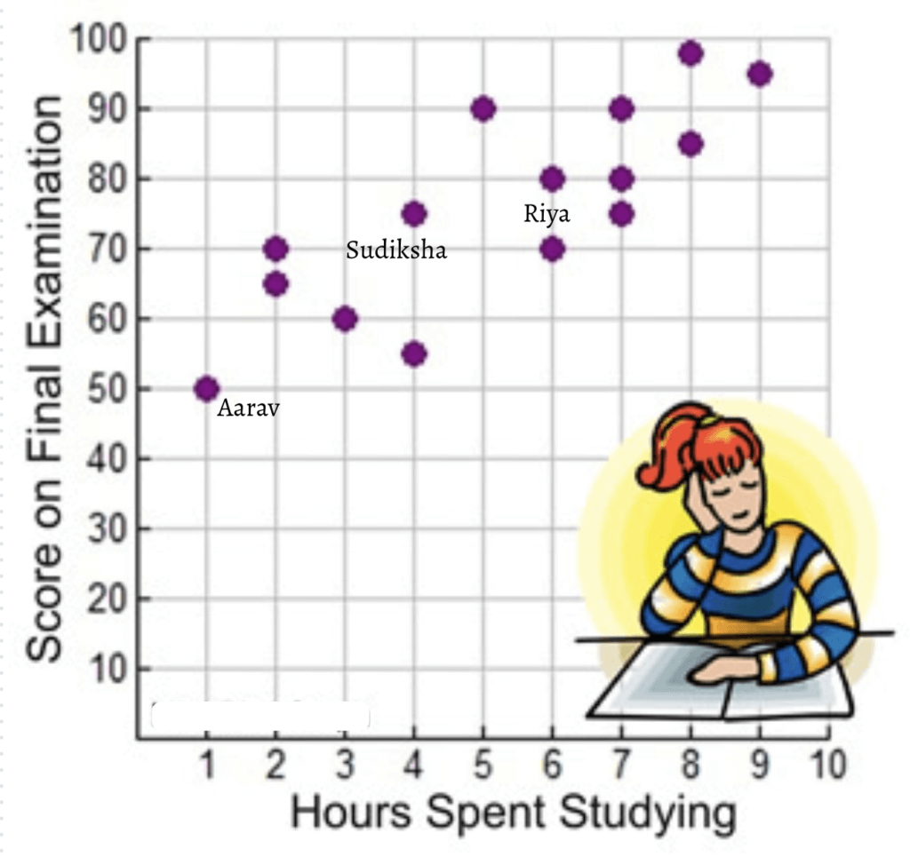
What to look for:
- Upward pattern = positive correlation
- Downward pattern = negative correlation
- Random scatter = no correlation
5. Map: Geographic Data
Best for: Showing data across locations
Example: Sales by state in India
How to create:
- Drag State to the canvas (Tableau recognizes geography)
- Drag Sales to Color
- Tableau creates a map automatically!
Result: Map with states colored by sales value
Requirements: Your data needs geographic fields (country, state, city, PIN code)
Chart Selection Guide
A chart selection guide helps you choose the right visual based on the question they want to answer. It links common data questions with the most suitable chart type, making the decision quick and logical. This ensures that the final visualization communicates the insight clearly and without confusion.
| Question You’re Asking | Best Chart Type |
|---|---|
| How do categories compare? | Bar chart |
| How does something change over time? | Line chart |
| What’s the proportion/share? | Pie chart (if few categories) |
| Is there a relationship between two things? | Scatter plot |
| How does data vary by location? | Map |
| What’s the distribution? | Histogram |
| How do two categories interact? | Heatmap |
Enhancing Your Visualizations
Enhancing your visualizations involves refining charts so they communicate information more clearly and effectively. Small adjustments like adding labels, choosing clean color schemes, and simplifying clutter help the viewer focus on what matters.
These improvements make your charts easier to read and ensure the key message stands out.
Adding Colors
Adding colors helps highlight important patterns and makes charts easier to understand. When used carefully, colors guide the viewer’s attention without distracting from the data.
How to add color:
- Drag a field to the Color mark
- Tableau assigns colors automatically
- Click on Color to customize the palette
Color best practices:
| Do | Don’t |
|---|---|
| Use color to highlight important data | Use too many colors (max 7-8) |
| Keep colorblind users in mind | Use red-green combinations |
| Use sequential colors for continuous data | Use random colors for ordered data |
| Be consistent across charts | Change color meanings between charts |
Adding Labels
Adding labels makes each value clear and removes guesswork for the viewer. They help the audience understand the chart quickly by showing exact numbers or names directly on the visual.
How to add labels:
- Drag a measure to the Label mark
- Or click on Label and select “Show mark labels”
Label tips:
- Don’t label everything — it creates clutter
- Label key points (highest, lowest, important)
- Ensure labels don’t overlap
Adding Tooltips
Tooltips appear when users hover over data points. Adding tooltips provides extra information when the viewer hovers over a data point. This keeps the chart clean while still giving access to detailed values whenever needed.
How to customize tooltips:
- Click on Tooltip in the Marks card
- Edit the text and add fields
- Format for readability
Example tooltip:
City: Delhi
Sales: ₹5,20,000
Growth: +15%
Using Filters
Filters let users focus on specific data. Using filters allows viewers to focus on specific parts of the data without changing the entire chart. It helps them explore information by selecting categories, dates or groups that matter most to them.
How to add filters:
- Drag a field to the Filters shelf
- Select which values to include
- Right-click → “Show Filter” to let users interact
Filter types:
| Type | Use Case |
|---|---|
| Dropdown | Select one value |
| Multiple values | Select several values |
| Slider | For continuous numbers |
| Date range | For time periods |
Building Dashboards
A dashboard combines multiple charts into one interactive view. Building dashboards involves bringing multiple charts together to tell a complete story in one view. A dashboard helps users compare information, spot patterns and interact with the data through filters or buttons.
When designed well, it provides a clear overview and allows quick exploration without switching between separate charts.
Why Dashboards?
Dashboards help users see different parts of the data in one place, giving a complete picture. They allow interactive exploration because filters and actions update all charts together. They also support effective storytelling by guiding viewers through insights in a logical flow. Finally, dashboards create a professional presentation that looks polished, clear and comprehensive.
Creating a Dashboard
Step 1: Create individual worksheets (charts)
                    ↓
Step 2: Click "New Dashboard" (tab at bottom)
                    ↓
Step 3: Drag worksheets onto the dashboard canvas
                    ↓
Step 4: Arrange and resize charts
                    ↓
Step 5: Add filters and interactivity
                    ↓
Step 6: Add titles and explanations
Dashboard Layout Tips
| Tip | Why It Matters |
|---|---|
| Start with most important chart | Viewers look top-left first |
| Maintain visual hierarchy | Guide the eye through data |
| Align charts properly | Looks professional |
| Don’t overcrowd | White space helps readability |
| Add context | Titles, labels, explanations |
| Test interactivity | Ensure filters work correctly |
Example Dashboard: School Performance
┌─────────────────────────────────────────────────────────┐
│           SCHOOL PERFORMANCE DASHBOARD 2024             │
├─────────────────────────────┬───────────────────────────┤
│                             │                           │
│   [BAR CHART]               │   [LINE CHART]            │
│   Average Scores by         │   Monthly Attendance      │
│   Subject                   │   Trend                   │
│                             │                           │
├─────────────────────────────┼───────────────────────────┤
│                             │                           │
│   [MAP]                     │   [PIE CHART]             │
│   Performance by            │   Student Distribution    │
│   District                  │   by Grade                │
│                             │                           │
├─────────────────────────────┴───────────────────────────┤
│   Filters: [Year ▼] [Subject ▼] [District ▼]            │
└─────────────────────────────────────────────────────────┘
Hands-On Project: Student Survey Dashboard
Let’s create a complete dashboard using sample student data.
The Data
| Student | Gender | City | Subject | Score | Study_Hours |
|---|---|---|---|---|---|
| Rahul | Male | Delhi | Math | 85 | 3 |
| Priya | Female | Mumbai | Math | 92 | 4 |
| Amit | Male | Delhi | Science | 78 | 2.5 |
| … | … | … | … | … | … |
Step-by-Step Instructions
Chart 1: Average Score by Subject (Bar Chart)
- Drag Subject to Columns
- Drag Score to Rows
- Tableau shows SUM — change to AVG (click dropdown on Score)
- Add Color by dragging Subject to Color
- Add Labels
Chart 2: Score vs. Study Hours (Scatter Plot)
- New Worksheet
- Drag Study_Hours to Columns
- Drag Score to Rows
- Drag Student to Detail
- Add trendline: Analytics pane → Trendline
Chart 3: Students by City (Map)
- New Worksheet
- Double-click City (Tableau creates map)
- Drag Number of Records to Size
- Drag Average Score to Color
Chart 4: Gender Distribution (Pie)
- New Worksheet
- Drag Gender to Color
- Drag Number of Records to Angle
- Change chart type to Pie
Combine into Dashboard:
- New Dashboard
- Drag all four worksheets
- Arrange in 2×2 grid
- Add filters for City and Subject
- Add title: “Student Performance Analysis”
Data Visualization Best Practices
Data visualization best practices help you create charts that are clear, accurate and easy to understand. These guidelines focus on choosing the right chart, removing clutter and highlighting what matters most. When followed consistently, they make your visuals more confident and meaningful for any audience.
| ✅ Do | ❌ Don’t |
|---|---|
| Choose the right chart for your data | Use pie charts for more than 5 categories |
| Start bar chart axes at zero | Truncate axes to exaggerate differences |
| Use clear, descriptive titles | Leave charts without context |
| Keep design simple and clean | Add unnecessary decorations (3D, shadows) |
| Use consistent colors | Change color meanings between charts |
| Label important data points | Label everything (creates clutter) |
| Test with your audience | Assume everyone understands your chart |
| Tell a story with your data | Just show numbers without insight |
Common Visualization Mistakes
Avoiding these errors helps the viewer focus on the real message without distraction:
| Mistake | Problem | Solution |
|---|---|---|
| Truncated Y-axis | Exaggerates small differences | Start axis at zero |
| Too many colors | Confusing and hard to read | Limit to 5-7 colors |
| 3D charts | Distorts perception | Use 2D charts |
| Missing labels | Viewers don’t understand | Add clear titles and labels |
| Wrong chart type | Miscommunicates data | Match chart to data type |
| Cluttered design | Overwhelms viewers | Simplify and focus |
Activity: Create Your Own Visualization
Task: Using the data below, create three visualizations and combine them into a dashboard.
Data: Class 9 Book Reading Survey
| Student | Books_Read | Favorite_Genre | Hours_Per_Week | City |
|---|---|---|---|---|
| Aarav | 12 | Fiction | 5 | Delhi |
| Bhavya | 8 | Science | 3 | Mumbai |
| Chitra | 15 | Fiction | 7 | Chennai |
| Deepak | 6 | History | 2 | Delhi |
| Eesha | 20 | Science | 8 | Mumbai |
| Farhan | 10 | Fiction | 4 | Kolkata |
| Gauri | 14 | History | 6 | Chennai |
| Harsh | 5 | Science | 2 | Kolkata |
Create:
- Bar chart: Average books read by city
- Pie chart: Favorite genre distribution
- Scatter plot: Hours per week vs. books read
(See Answer Key for expected outputs)
Quick Recap
- Data visualization transforms numbers into pictures for faster understanding.
- Tableau Public is a free, powerful tool for creating interactive visualizations.
- Dimensions are categories (blue); Measures are numbers (green).
- Bar charts compare categories; Line charts show trends over time.
- Pie charts show proportions (use sparingly); Scatter plots show relationships.
- Maps visualize geographic data effectively.
- Colors, labels, and tooltips enhance understanding.
- Filters let users explore data interactively.
- Dashboards combine multiple charts for complete data stories.
- Best practices: choose the right chart, start axes at zero, keep design simple, tell a story.
Next Lesson: Why Math is Important for AI: Linear Algebra, Calculus, Statistics and Probability Explained
Previous Lesson: Types of Data in AI: How to Acquire, Process and Interpret Data (Qualitative vs Quantitative)
EXERCISES
A. Fill in the Blanks
- _______________________ transforms raw numbers into visual pictures for better understanding.
- In Tableau, categorical data is called _______________________ and shown with blue icons.
- In Tableau, numerical data is called _______________________ and shown with green icons.
- A _______________________ chart is best for comparing values across categories.
- A _______________________ chart is best for showing trends over time.
- A _______________________ plot shows the relationship between two numerical variables.
- Multiple charts combined into one view is called a _______________________.
- _______________________ allow users to focus on specific subsets of data.
- Pie charts should not have more than _______________________ categories.
- In visualization, the Y-axis should generally start at _______________________ for bar charts.
B. Multiple Choice Questions
1. Which chart is best for showing how sales change over months?
(a) Pie chart
(b) Bar chart
(c) Line chart
(d) Scatter plot
2. In Tableau, “Dimensions” are:
(a) Numerical data like sales and count
(b) Categorical data like names and cities
(c) Chart properties like color and size
(d) Filter settings
3. Scatter plots are best for showing:
(a) Proportions of a whole
(b) Trends over time
(c) Relationships between two variables
(d) Comparison across categories
4. Which is a poor choice for visualization?
(a) Bar chart for comparing 5 products
(b) Line chart for monthly temperature
(c) Pie chart for 15 different categories
(d) Map for sales by state
5. Tableau Public is:
(a) Paid software only
(b) Free visualization tool
(c) A programming language
(d) A database system
6. What do “Measures” represent in Tableau?
(a) Categories and labels
(b) Numbers that can be aggregated
(c) Filter options
(d) Chart titles
7. Which color practice is recommended?
(a) Use as many colors as possible
(b) Use red-green combinations
(c) Limit colors to 5-7 maximum
(d) Change color meanings between charts
8. Tooltips in Tableau:
(a) Are chart titles
(b) Appear when hovering over data
(c) Filter the data
(d) Export charts
9. Why should bar chart Y-axes start at zero?
(a) It looks better
(b) Tableau requires it
(c) To avoid exaggerating differences
(d) To save space
10. A dashboard is used to:
(a) Create single charts
(b) Combine multiple visualizations
(c) Store data
(d) Write code
C. True or False
- Pie charts are ideal for displaying 20 different categories. (__)
- Tableau automatically identifies dimensions and measures. (__)
- Line charts are best for showing data over time. (__)
- You need to write code to create charts in Tableau. (__)
- Scatter plots can reveal correlations between variables. (__)
- Truncating the Y-axis is a recommended practice. (__)
- Filters make dashboards interactive. (__)
- Colors should be consistent across charts in a dashboard. (__)
- Data visualization makes patterns harder to see. (__)
- Tableau Public requires a paid subscription. (__)
D. Define the Following (30-40 words each)
- Data Visualization
- Tableau
- Dimensions (in Tableau)
- Measures (in Tableau)
- Dashboard
- Scatter Plot
- Filter (in visualization)
E. Very Short Answer Questions (40-50 words each)
- Why is data visualization important for understanding data?
- What is the difference between dimensions and measures in Tableau?
- When should you use a bar chart vs. a line chart?
- Why are pie charts not recommended for many categories?
- What is a scatter plot and what does it reveal?
- How do filters enhance a dashboard?
- What are tooltips and how do they help users?
- Name three common data visualization mistakes.
- What are the steps to create a dashboard in Tableau?
- Why should bar chart axes start at zero?
F. Long Answer Questions (75-100 words each)
- Explain the purpose of data visualization. Why do humans understand visuals better than tables of numbers?
- Describe the Tableau interface. What are the main components and what does each do?
- Create a chart selection guide: For each scenario, recommend the best chart type and explain why.
- What are the best practices for creating effective data visualizations? List and explain at least five.
- You have data about your city’s monthly rainfall for the past year. Describe how you would visualize this in Tableau step by step.
- Explain what a dashboard is. How would you design a dashboard to show your school’s annual performance?
- What are common visualization mistakes that mislead viewers? How can you avoid them?
ANSWER KEY
A. Fill in the Blanks – Answers
- Data visualization — Converting numbers to visuals.
- Dimensions — Categorical data in Tableau.
- Measures — Numerical data in Tableau.
- bar — Bar charts compare categories.
- line — Line charts show time trends.
- scatter — Scatter plots show relationships.
- dashboard — Multiple charts combined.
- Filters — Filters focus on specific data.
- 5 (or 5-7) — Too many makes pie charts unreadable.
- zero — Starting at zero prevents exaggeration.
B. Multiple Choice Questions – Answers
- (c) Line chart — Best for trends over time.
- (b) Categorical data like names and cities — Dimensions are categories.
- (c) Relationships between two variables — Scatter plots show correlation.
- (c) Pie chart for 15 different categories — Too many categories.
- (b) Free visualization tool — Tableau Public is free.
- (b) Numbers that can be aggregated — Measures are quantitative.
- (c) Limit colors to 5-7 maximum — Too many colors confuse.
- (b) Appear when hovering over data — Interactive information.
- (c) To avoid exaggerating differences — Truncated axes mislead.
- (b) Combine multiple visualizations — Dashboards show complete picture.
C. True or False – Answers
- False — Pie charts work best with 5 or fewer categories.
- True — Tableau auto-identifies data types.
- True — Line charts are ideal for time series.
- False — Tableau uses drag-and-drop, no coding needed.
- True — Scatter plots reveal positive/negative correlations.
- False — Truncating axes exaggerates differences.
- True — Filters enable interactive exploration.
- True — Consistent colors improve understanding.
- False — Visualization makes patterns EASIER to see.
- False — Tableau Public is FREE.
D. Definitions – Answers
1. Data Visualization: The graphical representation of data using charts, graphs, and maps to help people understand patterns, trends, and insights more quickly than reading raw numbers.
2. Tableau: A powerful data visualization software that allows users to create interactive charts and dashboards through drag-and-drop interface without requiring programming knowledge.
3. Dimensions (in Tableau): Categorical fields (qualitative data) like names, cities, and categories, shown with blue icons. Used to categorize, segment, and reveal details.
4. Measures (in Tableau): Numerical fields (quantitative data) like sales, counts, and temperatures, shown with green icons. Can be aggregated with calculations like sum and average.
5. Dashboard: A single view that combines multiple visualizations (charts, maps, tables) to provide a comprehensive overview of data, often with interactive filters.
6. Scatter Plot: A chart type that plots data points on X and Y axes to show relationships between two numerical variables. Reveals correlations and patterns.
7. Filter (in visualization): A control that allows users to limit the data displayed, focusing on specific categories, time periods, or value ranges for targeted analysis.
E. Very Short Answer Questions – Answers
1. Why visualization is important:
Humans process visuals 60,000 times faster than text. Visualization reveals patterns, trends, and outliers that are hidden in tables of numbers, making complex data understandable at a glance.
2. Dimensions vs. measures:
Dimensions are categorical (qualitative) data like names and cities — used to categorize. Measures are numerical (quantitative) data like sales and counts — used for calculations and aggregations.
3. Bar chart vs. line chart:
Use bar charts for comparing values across different categories (cities, products). Use line charts for showing how values change over time (monthly sales, temperature trends).
4. Why pie charts aren’t for many categories:
Humans struggle to compare angles accurately. With more than 5-7 slices, pie charts become cluttered and differences are impossible to see. Bar charts work better for multiple categories.
5. Scatter plot and what it reveals:
A scatter plot places data points on X and Y axes based on two numerical values. It reveals correlations: upward pattern (positive), downward pattern (negative), or random scatter (no correlation).
6. How filters enhance dashboards:
Filters let users interact with data, focusing on specific time periods, categories, or value ranges. They enable personalized exploration without creating multiple separate charts.
7. Tooltips and their benefit:
Tooltips are pop-up information boxes appearing when users hover over data points. They provide additional details (exact values, percentages) without cluttering the main visualization.
8. Three visualization mistakes:
Truncating Y-axis (exaggerates differences), using pie charts for many categories (hard to read), and using too many colors (confuses viewers). Also: missing labels and 3D effects.
9. Dashboard creation steps:
Create individual worksheets (charts) first. Click New Dashboard. Drag worksheets onto canvas. Arrange and resize charts. Add filters for interactivity. Add titles and labels. Test functionality.
10. Why axes should start at zero:
When bar chart axes don’t start at zero, small differences appear huge. A bar from 95-100 looks 5x bigger than 95-96, even though the difference is only 5%. This misleads viewers.
F. Long Answer Questions – Answers
1. Purpose of data visualization:
Data visualization transforms raw numbers into graphical representations that humans can understand quickly. Our brains evolved to process visual information — recognizing patterns, colors, and shapes instantly. A table with 1,000 numbers takes minutes to analyze, but a chart shows the pattern in seconds. Visualizations reveal trends (rising/falling), comparisons (A vs B), proportions (parts of whole), and outliers (unusual values). They make complex data accessible to non-experts.
2. Tableau interface components:
Data Pane (left): Shows connected data with Dimensions (blue, categorical) and Measures (green, numerical). Canvas (center): Where visualization appears. Rows and Columns shelves: Drag fields here to build chart structure. Marks card: Control visual properties — Color, Size, Label, Tooltip. Filters shelf: Add interactive data filters. Show Me panel: Quick-select chart types. Worksheets/Dashboard tabs: Navigate between individual charts and combined dashboards.
3. Chart selection guide:
Comparing categories (5 cities’ sales): Bar chart — easy comparison of discrete values. Showing trend over time (monthly revenue): Line chart — reveals direction and rate of change. Showing parts of whole (market share): Pie chart — only if 5 or fewer categories. Finding relationship (study hours vs. scores): Scatter plot — reveals correlation. Geographic data (sales by state): Map — spatial patterns visible. Distribution (age groups): Histogram — shows frequency distribution.
4. Five visualization best practices:
Choose right chart type — match chart to data and question. Start axes at zero — prevents exaggerating differences in bar charts. Limit colors — 5-7 maximum, with consistent meaning. Add clear labels — titles, axis labels, and data labels where needed. Keep design simple — avoid 3D effects, unnecessary decorations. Tell a story — highlight key insights, guide viewer’s attention. Test with audience — ensure they understand your visualization.
5. Monthly rainfall visualization steps:
Connect Excel/CSV with rainfall data to Tableau. Drag Month to Columns (ensure it’s treated as date). Drag Rainfall_mm to Rows. Click Line in Marks card to create line chart. Add color gradient if desired. Add labels for highest and lowest months. Create tooltip showing exact rainfall value. Add title “Monthly Rainfall [Year]”. Add filter if multiple years exist. Consider adding reference line for average rainfall.
6. Dashboard for school performance:
A dashboard combines multiple charts for complete picture. Design: Top section — summary KPIs (total students, average score, pass rate). Left — bar chart comparing subject-wise averages. Right — line chart showing monthly attendance trend. Bottom left — map showing performance by class/section. Bottom right — pie chart of grade distribution. Add filters: Year, Subject, Class, Section. Include title and date. Use consistent colors (green=good, red=needs attention). Add text insights explaining key findings.
7. Common visualization mistakes:
Truncated Y-axis: Starting at 95 instead of 0 makes 5-point difference look huge — always start at zero. Too many colors: Using 15 different colors confuses viewers — limit to 5-7. Wrong chart type: Pie chart for time data misrepresents trends — match chart to data type. 3D effects: Distort perception and hide data — use 2D. Missing context: Charts without titles or labels are meaningless — always label clearly. Cluttered design: Too many elements overwhelm — simplify and focus on key message.
Activity Answer Key
Expected Outputs:
Chart 1: Average Books by City (Bar)
- Delhi: (12+6)/2 = 9 books
- Mumbai: (8+20)/2 = 14 books
- Chennai: (15+14)/2 = 14.5 books
- Kolkata: (10+5)/2 = 7.5 books
Chennai and Mumbai students read most!
Chart 2: Favorite Genre (Pie)
- Fiction: 3 students (37.5%)
- Science: 3 students (37.5%)
- History: 2 students (25%)
Fiction and Science equally popular.
Chart 3: Hours vs. Books (Scatter)
Shows positive correlation — students who read more hours read more books. Eesha (8 hrs, 20 books) is top right; Harsh (2 hrs, 5 books) is bottom left.
Dashboard: Combine all three with City filter. Title: “Class 9 Reading Habits Analysis”
Next Lesson: Why Math is Important for AI: Linear Algebra, Calculus, Statistics and Probability Explained
Previous Lesson: Types of Data in AI: How to Acquire, Process and Interpret Data (Qualitative vs Quantitative)