

What Will You Learn?
By the end of this lesson, you will be able to:
- Understand why data exploration is essential before building AI models
- Identify patterns, trends, and anomalies in data
- Use different types of graphs and charts for visualization
- Clean and prepare data for the modelling stage
- Recognize common data issues and how to fix them
Imagine you’re a detective who just received thousands of clues about a mystery. Would you immediately start making conclusions? Or would you first organize, examine, and look for patterns in those clues?
A good detective examines evidence carefully before drawing conclusions. The same applies to AI.
After collecting data, you can’t just throw it into an AI model and hope for the best. First, you need to explore it. Look at it from different angles. Find patterns. Spot problems. Clean up the mess.
This is what Data Exploration is all about. It’s like shining a light on your data to see what’s really there — the good, the bad, and the unexpected.
What is Data Exploration?
Data Exploration is the third stage of the AI Project Cycle where we:
- Examine and understand the data we collected
- Visualize data using graphs and charts
- Identify patterns, trends, and relationships
- Find and fix problems in the data
- Prepare clean data for the modelling stage
Think of it as quality control plus investigation. You’re asking: “What does this data tell me? Is it ready for AI? What needs to be fixed?”
💡 Key Insight
You cannot build a good AI model if you don’t understand your data. Exploration reveals what’s in your data, and visualization makes patterns visible.
Why is Data Exploration Important?
You need to explore data because raw data often has mistakes, missing values, or hidden patterns that can mislead the model during training. By exploring it first, you make sure your analysis or project is built on clean, accurate information.
| Without Exploration | With Exploration |
|---|---|
| Hidden errors corrupt your model | Errors are found and fixed |
| You miss important patterns | Patterns guide your modelling approach |
| Wrong assumptions lead to wrong solutions | Data-driven decisions |
| Wasted time training on bad data | Efficient, effective training |
| Surprising results after deployment | Predictable, reliable outcomes |
Real Example:
Imagine building an AI to predict student exam scores. Without exploration, you might not notice:
- Some scores are entered as “85%” and others as “85” (inconsistent format)
- 50 students have “N/A” for attendance (missing data)
- One student shows 150% score (data entry error)
- Students who attended extra classes scored 20% higher (important pattern!)
Exploration reveals all of this before you end up training a flawed model because your data had errors.
The Four Steps of Data Exploration
There are four steps to exploring data:
understand —> visualize —> identify pattern —> clean
Step 1: Get to Know Your Data
Start by understanding what you have:
| Question to Ask | Why It Matters |
|---|---|
| How many records/rows? | Enough data for AI to learn? |
| How many features/columns? | What information do we have? |
| What type is each feature? | Numbers, text, dates? |
| What’s the range of values? | Any unexpected extremes? |
| Are there missing values? | Gaps we need to fill? |
Example: Student Performance Dataset
This is what data exploration reveals:
Records: 1000 students
Features: 8 (Name, Age, Attendance%, Study Hours, Previous Marks, Extra Classes, Home Study, Final Score)
Missing Values: 45 in Attendance, 12 in Previous Marks
Range of Final Score: 15 to 98 (one suspiciously high at 105 — error!)
Step 2: Visualize the Data
Numbers alone don’t tell the whole story. Using visual representation of data such as graphs and charts makes it easier to spot patterns. We will talk about visualization in greater detail in the next section.
Step 3: Find Patterns and Relationships
Finding patterns in data helps you understand what is actually going on before you start training models on it to take decisions. It helps you identify unusual datasets and outliers that can adversely affect the outcome of your model.
Ask questions like:
- Which features affect the outcome most?
- Are there groupings in the data?
- What trends appear over time?
Step 4: Clean and Prepare
Finally you need to fix the problems you found so that you have an error-free dataset for training the AI model. Some of the ways that thi sfixing can happen includes:
- Replacing erroneous data with correct data
- Convert formats for consistency
- Fill or remove missing values
- Remove duplicates
Data Visualization: Making Data Speak
Visualization converts numbers into pictures. Our brains process images much faster than tables of numbers. There are many different varieties of chart you can use for data visualization.
Types of Charts and When to Use Them
Ther are many different types of charts that can be used for data visualization. I am discussing some of the most common ones here. You can read about the rest here if you want to dive deeper.
| Chart Type | Best For | Example Use |
|---|---|---|
| Bar Chart | Comparing quantities across categories | Marks in different subjects |
| Line Graph | Showing changes over time | Temperature across months |
| Pie Chart | Showing parts of a whole | Gender distribution in class |
| Scatter Plot | Finding relationships between two variables | Height vs. Weight |
| Histogram | Showing distribution of one variable | Age distribution of students |
| Heat Map | Showing patterns in tables | Correlation between features |
Bar Chart
What it does: Compares values across different categories.
When to use: Comparing discrete items like subjects, cities, or products.
Example: Students’ marks in different subjects
Subject    | Marks (Average)
-----------+----------------
Maths      | ████████████████ 78
Science    | ██████████████ 72
English    | █████████████████ 85
Hindi      | ███████████████ 75
What this tells us: Students perform best in English and need more help in Science.
Line Graph
What it shows: Trends and changes over time.
When to use: Tracking how something changes — temperature, sales, performance over days/months/years.
Example: Monthly website visitors
Jan  Feb  Mar  Apr  May  Jun
 │    │    │    │    │    │
 *────*────*────*────*────*
100  150  200  180  250  300
What this tells us: Traffic is growing overall, with a small dip in April.
Pie Chart
What it shows: How a whole is divided into parts.
When to use: Showing percentages or proportions that add up to 100%.
Example: Students’ favorite subjects
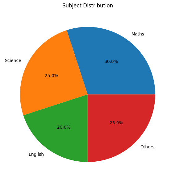
What this tells us: Preferences are fairly evenly distributed, with Maths slightly ahead.
Scatter Plot
What it shows: Relationship between two numerical variables.
When to use: Finding correlations — does one thing affect another?
Example: Study hours vs. Exam scores
Score
  │    *
  │  * * *
  │ * * * *
  │* * * * *
  └────────────
    Study Hours
What this tells us: More study hours generally lead to higher scores (positive correlation).
🧪 Think About It
If the scatter plot showed no pattern (dots everywhere randomly), what would that tell you?
Answer: No relationship between study hours and scores.
Histogram
What it shows: Distribution — how often different values occur.
When to use: Understanding the spread of one variable.
Example: Distribution of kids’ ages in a society
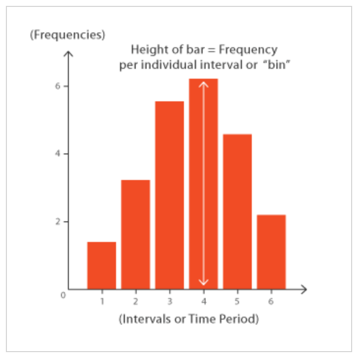
What this tells us: Most kids are 3-4 years old; few are 1 or 5.
Identifying Patterns and Trends
Identifying patterns and trends means noticing how data changes or repeats over time. It helps you understand what is common, what is unusual, and what might happen next.
We need to identify these patterns so we can make better decisions about which data to choose for the final datasets, avoid errors, and focus on the factors that truly matter in a dataset.
Types of Patterns to Look For:
1. Trends
- Upward trend: Values increasing over time
- Downward trend: Values decreasing
- Stable: Values staying roughly the same
2. Correlations
- Positive: When A increases, B increases too
- Negative: When A increases, B decreases
- No correlation: A and B don’t affect each other
3. Clusters
Groups of similar data points that naturally group together.
4. Outliers
Unusual data points that don’t fit the pattern — might be errors or special cases.
Example: Finding Patterns in Student Data
| Pattern Found | What It Means | Action |
|---|---|---|
| Students with >80% attendance score 15% higher | Attendance matters! | Include attendance as important feature |
| 5 students show scores above 100 | Data entry errors | Fix or remove these errors |
| Morning class students cluster around 70-80 | Time of day might matter | Consider adding “class time” as feature |
| One student has 0% attendance but 90% score | Outlier — possible error or exception | Investigate further |
Data Cleaning: Fixing What’s Broken
Raw data is usually messy. Data cleaning prepares it for AI.
Common Problems That Make Data Messy and Solutions
| Problem | Example | Solution |
|---|---|---|
| Missing Values | Attendance: N/A | Fill with average, or remove record |
| Inconsistent Formats | “85%”, “85”, “Eighty-Five” | Convert all to same format (85) |
| Duplicates | Same student entered twice | Remove duplicate entries |
| Outliers (Errors) | Score: 150 (impossible) | Fix if error, flag if genuine |
| Wrong Data Types | Age stored as text “fifteen” | Convert to number (15) |
| Inconsistent Categories | “Male”, “M”, “male”, “MALE” | Standardize to one format |
Handling Missing Values
Three main approaches:
| Approach | When to Use | Example |
|---|---|---|
| Remove | Few missing values, lots of data | Delete 10 rows out of 1000 |
| Fill with average | Numerical data, typical values | Replace N/A attendance with class average |
| Fill with mode | Categorical data | Replace missing “Gender” with most common |
| Keep as separate category | “Missing” might be meaningful | “Unknown” category |
💡 Important
Document every cleaning decision. Future you (or your team) needs to know what was changed and why.
Tools for Data Exploration
While you can do basic exploration with spreadsheets, these tools are common for larger datasets:
| Tool | Type | Good For |
|---|---|---|
| Microsoft Excel | Spreadsheet | Small datasets, basic charts |
| Google Sheets | Spreadsheet | Collaboration, basic analysis |
| Tableau | Visualization | Interactive dashboards |
| Python (Pandas) | Programming | Large datasets, automation |
| R | Programming | Statistical analysis |
You’ll likely use Excel or Google Sheets in class for basic exploration, and may be introduced to Tableau for visualization.
Activity: Explore This Dataset
Here’s a small dataset about student exam performance:
| Student | Attendance% | Study_Hours | Extra_Class | Final_Score |
|---|---|---|---|---|
| A | 90 | 4 | Yes | 85 |
| B | 75 | 2 | No | 65 |
| C | N/A | 3 | Yes | 72 |
| D | 85 | 5 | Yes | 88 |
| E | 60 | 1 | No | 45 |
| F | 95 | 4 | No | 82 |
| G | 70 | 2 | Yes | 70 |
| H | 80 | 150 | No | 75 |
Questions to answer:
- How many records are there?
- What’s the average Final Score?
- Identify one missing value. How would you fix it?
- Identify one outlier. Why is it suspicious?
- What pattern do you notice between Study Hours and Score?
- Do students with Extra Classes score higher?
(Answers in Answer Key)
Real-World Case Study: Exploring Weather Data
A team wanted to build an AI for weather prediction. During data exploration, they discovered:
| What They Found | What They Did |
|---|---|
| Temperature data had gaps every Sunday | Sensor was turned off for maintenance — filled gaps using interpolation |
| Some humidity readings showed 150% (impossible) | Fixed data entry errors (15.0 entered as 150) |
| Strong pattern: High pressure → Clear weather | Made pressure a key feature in model |
| Monsoon months showed completely different patterns | Created separate models for monsoon vs. non-monsoon |
| 3% of wind speed data was missing | Filled with hourly averages from nearby stations |
Without exploration, their AI would have trained on faulty data and made wrong predictions!
Quick Recap
- Data Exploration is the third stage of the AI Project Cycle where we examine, visualize, and clean data.
- Visualization makes patterns visible through charts: bar charts, line graphs, pie charts, scatter plots, and histograms.
- Patterns to look for include trends (up/down/stable), correlations (positive/negative), clusters, and outliers.
- Data cleaning fixes problems like missing values, inconsistent formats, duplicates, and errors.
- Common issues: missing data, wrong formats, duplicates, outliers, and inconsistent categories.
- Missing values can be removed, filled with averages, or kept as separate categories.
- Always document your cleaning decisions.
- Clean, well-explored data leads to better AI models.
Next Lesson: AI Modelling Explained: Rule-Based vs Learning-Based Approach (With Examples)
Previous Lesson: Data Acquisition in AI: How to Collect, Source and Gather Data for Machine Learning Projects
EXERCISES
A. Fill in the Blanks
- Data Exploration is the _____________________ stage of the AI Project Cycle.
- A _____________________ chart is best for showing changes over time.
- A _____________________ plot shows the relationship between two numerical variables.
- An _____________________ is an unusual data point that doesn’t fit the normal pattern.
- When two variables increase together, they have a _____________________ correlation.
- A _____________________ chart shows how a whole is divided into parts.
- _____________________ cleaning involves fixing errors, missing values, and inconsistencies in data.
- A _____________________ shows the distribution of a single numerical variable.
- Missing values can be filled with the _____________________ (average) of available data.
- Data exploration makes _____________________ in data visible through visualization.
B. Multiple Choice Questions
1. Which stage of the AI Project Cycle is Data Exploration?
(a) First
(b) Second
(c) Third
(d) Fourth
2. Which chart is best for comparing quantities across categories?
(a) Line graph
(b) Bar chart
(c) Scatter plot
(d) Histogram
3. Which chart would you use to show monthly temperature changes?
(a) Pie chart
(b) Bar chart
(c) Line graph
(d) Histogram
4. An outlier is:
(a) A normal data point
(b) An unusual data point that doesn’t fit the pattern
(c) A missing value
(d) A duplicate entry
5. What does a scatter plot with dots going upward from left to right show?
(a) Negative correlation
(b) Positive correlation
(c) No correlation
(d) Missing data
6. If “Age” is stored as “fifteen” instead of “15”, this is an example of:
(a) Missing value
(b) Duplicate
(c) Wrong data type
(d) Outlier
7. Which is NOT a way to handle missing values?
(a) Remove the record
(b) Fill with average
(c) Ignore and use as-is
(d) Fill with most common value
8. A histogram is used to show:
(a) Trends over time
(b) Parts of a whole
(c) Distribution of values
(d) Comparison between categories
9. Why is data cleaning important?
(a) Makes files smaller
(b) Removes all data
(c) Fixes errors that would corrupt the AI model
(d) Changes the problem statement
10. Which tool is commonly used for data visualization?
(a) Paint
(b) Notepad
(c) Tableau
(d) Calculator
C. True or False
- Data Exploration comes after Modelling in the AI Project Cycle. (__)
- A line graph is best for showing changes over time. (__)
- A pie chart shows parts of a whole that add up to 100%. (__)
- Outliers should always be deleted from data. (__)
- A scatter plot can reveal correlations between two variables. (__)
- Missing values should be ignored and used as-is in AI training. (__)
- Inconsistent formats like “Male”, “M”, and “male” are a data problem. (__)
- Visualization helps find patterns that numbers alone might hide. (__)
- A histogram shows relationships between two variables. (__)
- Documenting cleaning decisions is unnecessary extra work. (__)
D. Define the Following (30-40 words each)
- Data Exploration
- Data Visualization
- Trend
- Correlation
- Outlier
- Data Cleaning
- Histogram
E. Very Short Answer Questions (40-50 words each)
- What is Data Exploration and why is it important for AI?
- Name five types of charts and when each is best used.
- What is the difference between a bar chart and a histogram?
- What is an outlier and how should it be handled?
- Explain positive and negative correlation with examples.
- What are three common data problems that need cleaning?
- How would you handle missing values in a numerical column?
- Why is visualizing data better than just looking at numbers?
- What questions should you ask when first exploring a dataset?
- What is a trend and how can you identify one in data?
F. Long Answer Questions (75-100 words each)
- Explain the four main steps of data exploration with examples.
- Describe five types of charts, when to use each, and what insights they provide.
- What are common data quality problems? Explain each with examples and solutions.
- You have a dataset with student attendance and exam scores. Describe how you would explore this data to find patterns.
- Explain the importance of data cleaning. What can go wrong if data isn’t cleaned before modelling?
- Compare and contrast scatter plots and line graphs. When would you use each?
- Create a data exploration plan for a dataset containing daily weather measurements (temperature, humidity, rainfall).
ANSWER KEY
A. Fill in the Blanks – Answers
- third — Data Exploration is the third stage, after Data Acquisition.
- line — Line graphs show changes and trends over time.
- scatter — Scatter plots reveal relationships between two numerical variables.
- outlier — Outliers are unusual data points outside normal patterns.
- positive — Positive correlation means both variables increase together.
- pie — Pie charts show parts of a whole, totaling 100%.
- Data — Data cleaning fixes errors, missing values, and inconsistencies.
- histogram — Histograms show the distribution of one variable.
- mean — Mean (average) is commonly used to fill missing numerical values.
- patterns — Visualization makes hidden patterns visible.
B. Multiple Choice Questions – Answers
- (c) Third — It follows Problem Scoping and Data Acquisition.
- (b) Bar chart — Bar charts compare values across categories.
- (c) Line graph — Line graphs show trends over time.
- (b) An unusual data point — Outliers don’t fit the normal pattern.
- (b) Positive correlation — Both variables increase together.
- (c) Wrong data type — Text instead of number is a type error.
- (c) Ignore and use as-is — This corrupts the AI model.
- (c) Distribution of values — Histograms show how values are spread.
- (c) Fixes errors that would corrupt the AI model — Clean data = better AI.
- (c) Tableau — Tableau is a popular data visualization tool.
C. True or False – Answers
- False — Exploration comes BEFORE Modelling.
- True — Line graphs excel at showing time-based changes.
- True — Pie chart segments total 100%.
- False — Outliers should be investigated; they might be errors or genuine special cases.
- True — Scatter plots reveal correlations visually.
- False — Missing values must be handled properly.
- True — Inconsistent formats cause processing problems.
- True — Visual patterns are easier to spot than numerical patterns.
- False — Histograms show distribution of ONE variable, not relationships.
- False — Documentation is essential for reproducibility and team understanding.
D. Definitions – Answers
1. Data Exploration: The third stage of the AI Project Cycle where we examine, visualize, and understand collected data to find patterns, identify problems, and prepare clean data for the modelling stage.
2. Data Visualization: The representation of data using graphical elements like charts, graphs, and plots to make patterns, trends, and relationships visible and easier to understand than raw numbers.
3. Trend: A general direction in which data values are moving over time, such as upward (increasing), downward (decreasing), or stable (staying roughly the same).
4. Correlation: A relationship between two variables where changes in one are associated with changes in the other. Positive correlation means both increase together; negative means one increases while the other decreases.
5. Outlier: A data point that significantly differs from other observations, lying far outside the normal range. It may indicate an error or a genuinely unusual case.
6. Data Cleaning: The process of fixing or removing incorrect, incomplete, duplicate, or improperly formatted data to ensure the dataset is accurate and ready for AI model training.
7. Histogram: A chart that shows the distribution of a single numerical variable by grouping values into ranges (bins) and showing the count of occurrences in each range.
E. Very Short Answer Questions – Answers
1. What is Data Exploration and why important?
Data Exploration is examining and visualizing data to understand it before building AI models. It’s important because it reveals patterns for modelling, identifies errors to fix, and ensures data quality — preventing wasted effort on flawed data.
2. Five chart types and uses:
Bar chart (comparing categories), Line graph (showing time trends), Pie chart (parts of whole), Scatter plot (two-variable relationships), Histogram (distribution of one variable). Each serves specific analytical purposes.
3. Bar chart vs histogram:
Bar charts compare discrete categories (subjects, cities) with gaps between bars. Histograms show distribution of continuous data (ages, scores) with bars touching, representing ranges of values.
4. Outlier definition and handling:
An outlier is an unusual data point far from others. Handle by: investigating if it’s an error (fix it), genuine but rare (keep and note), or corrupted (remove). Don’t automatically delete without investigation.
5. Positive and negative correlation:
Positive correlation: both variables increase together (study hours and exam scores). Negative correlation: one increases while the other decreases (screen time and sleep hours). Shown in scatter plots.
6. Three data problems needing cleaning:
Missing values (empty cells), inconsistent formats (“Male” vs “M” vs “male”), and duplicates (same record entered twice). Each causes problems in AI training and must be fixed.
7. Handling missing numerical values:
Options: fill with mean (average), fill with median (middle value), fill with most common value, remove rows with missing data, or use interpolation. Choice depends on data context.
8. Why visualization beats numbers:
Our brains process images faster than tables. A scatter plot instantly shows correlation that would take minutes to spot in number columns. Visualization reveals patterns, outliers, and relationships quickly.
9. Questions for exploring new dataset:
How many records? How many features? What data types? What’s the range of values? Are there missing values? Are there duplicates? What are unique values in categorical columns?
10. Trends and identification:
A trend is the general direction of data over time. Identify using line graphs — if line generally goes up, it’s an upward trend; going down is downward; staying flat is stable.
F. Long Answer Questions – Answers
1. Four steps of data exploration:
Step 1: Get to Know Data — count records, list features, check types and ranges. Step 2: Visualize — create charts to see patterns (bar charts, scatter plots). Step 3: Find Patterns — identify correlations, trends, clusters, outliers. Step 4: Clean and Prepare — fix errors, handle missing values, standardize formats. Example: For student data, count students (1000), plot scores distribution, find attendance-score correlation, fix 5 invalid scores.
2. Five chart types:
Bar charts compare categories (subject marks — shows English highest). Line graphs show time changes (monthly sales — shows upward trend). Pie charts show proportions (gender split — 60% male). Scatter plots reveal relationships (height vs weight — positive correlation). Histograms show distribution (age spread — most students 14-15). Each serves different analytical needs.
3. Data quality problems:
Missing values (blank cells) — fill with average or remove. Inconsistent formats (“Yes”/”Y”/”yes”) — standardize to one format. Duplicates — remove extra entries. Outliers (score=150) — investigate and fix errors. Wrong types (age=”fifteen”) — convert to numbers. Each problem corrupts AI training differently.
4. Exploring attendance-scores data:
First, count records and check for missing values. Create histogram of scores to see distribution. Make scatter plot of attendance vs scores to find correlation. Calculate average scores for high vs low attendance groups. Look for outliers (impossible scores or attendance). Check for missing values in both columns. Clean issues found before modelling.
5. Importance of data cleaning:
Without cleaning: errors train AI to make wrong predictions, missing values cause processing failures, inconsistent formats confuse algorithms, outliers skew patterns. Example: If one score is 150 (error) instead of 15, average calculations are wrong. Dirty data leads to unreliable AI that makes bad decisions in real use.
6. Scatter plot vs line graph:
Scatter plots show relationship between two variables at one point in time (height vs weight) — dots can be anywhere. Line graphs show change over time for one variable (temperature across days) — points are connected chronologically. Use scatter plots for correlations; use line graphs for trends over time.
7. Weather data exploration plan:
Step 1: Count days of data, check for gaps. Step 2: Create line graphs for temperature over time, humidity over months. Step 3: Make scatter plot of humidity vs rainfall to find correlation. Step 4: Identify outliers (temperature=100°C is error). Step 5: Check missing values — rainy days might have gaps. Step 6: Look for seasonal patterns — monsoon vs dry months. Step 7: Clean errors, fill gaps, document changes.
Activity Answers
- Records: 8 students
- Average Final Score: (85+65+72+88+45+82+70+75)/8 = 72.75
- Missing value: Student C has “N/A” for Attendance. Fix by filling with class average (approximately 79%)
- Outlier: Student H has Study_Hours = 150 (impossible — probably meant 1.5 or 15). This needs investigation and correction.
- Pattern: Higher study hours generally correlate with higher scores (A has 4 hours/85 score; E has 1 hour/45 score)
- Extra Class impact: Students with Extra Classes: A(85), C(72), D(88), G(70) = Avg 78.75. Without: B(65), E(45), F(82), H(75) = Avg 66.75. Yes, Extra Classes correlate with higher scores!
Next Lesson: AI Modelling Explained: Rule-Based vs Learning-Based Approach (With Examples)
Previous Lesson: Data Acquisition in AI: How to Collect, Source and Gather Data for Machine Learning Projects